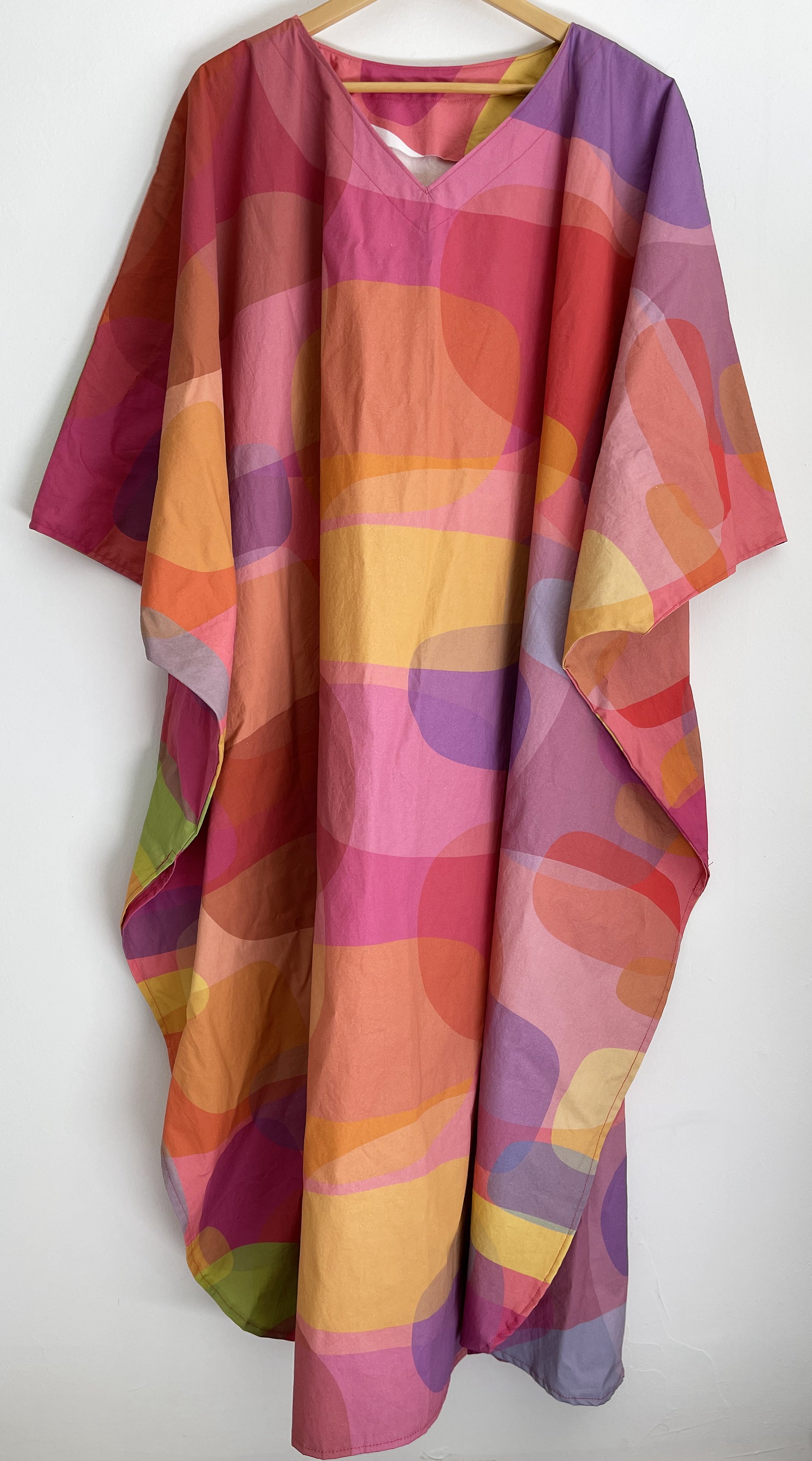
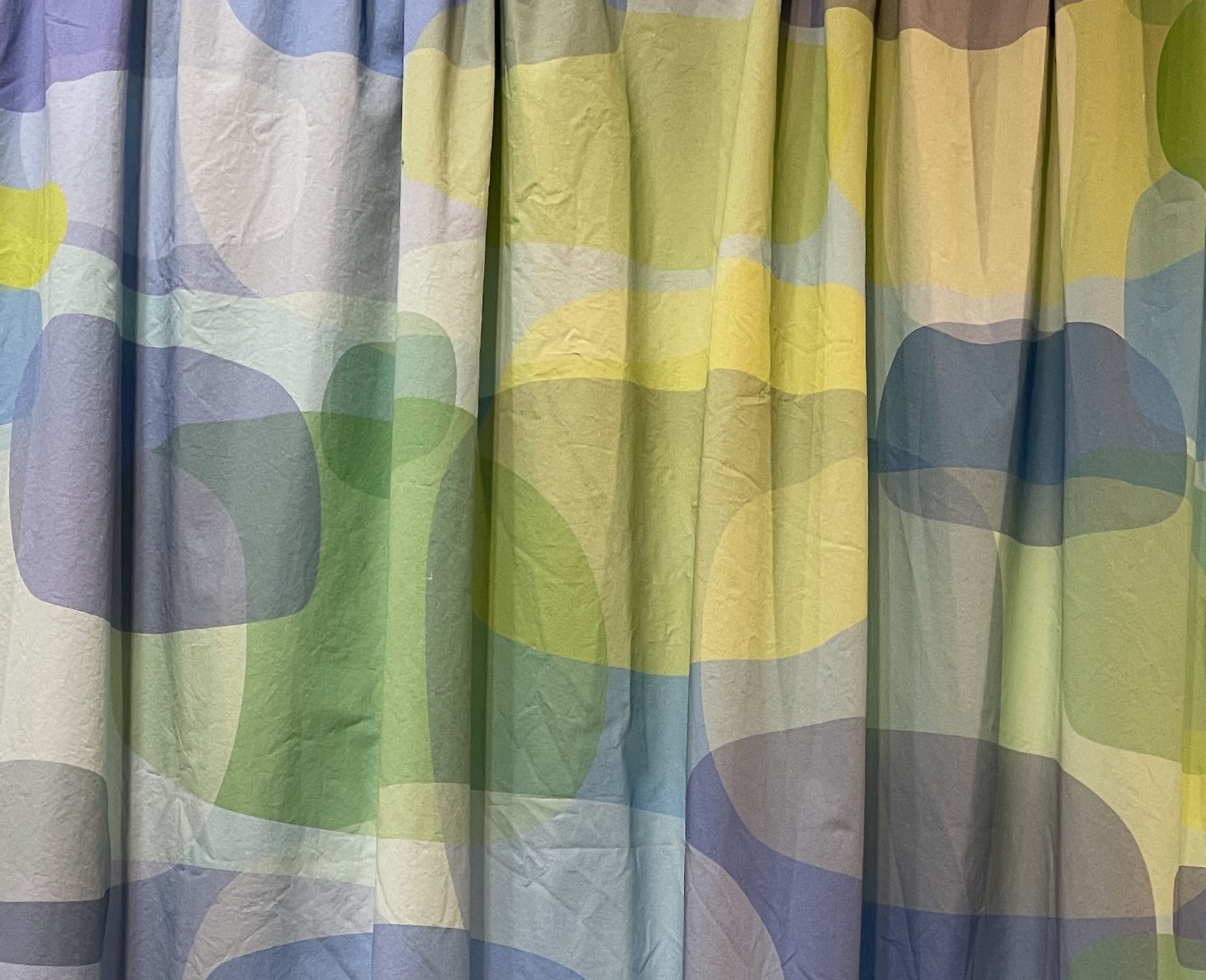
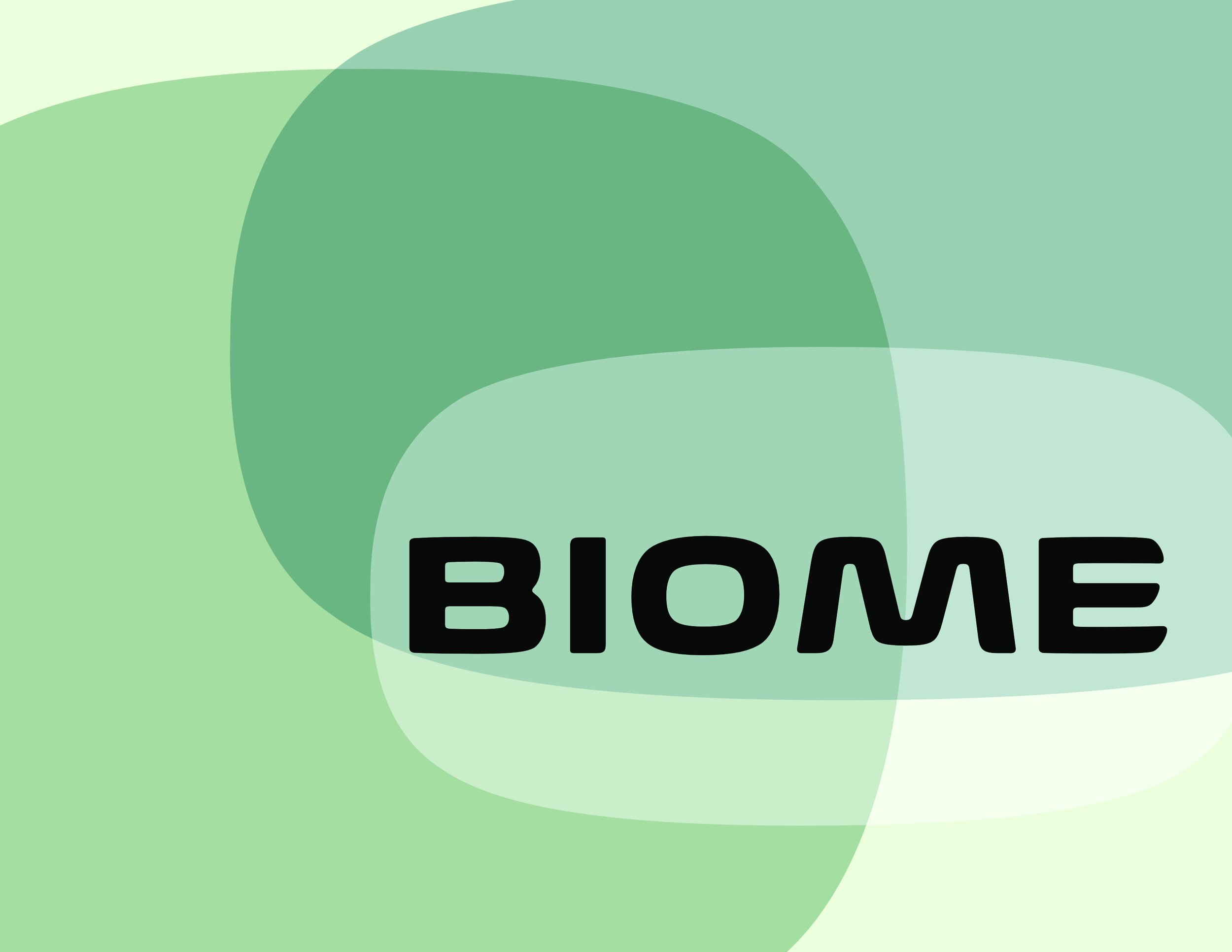
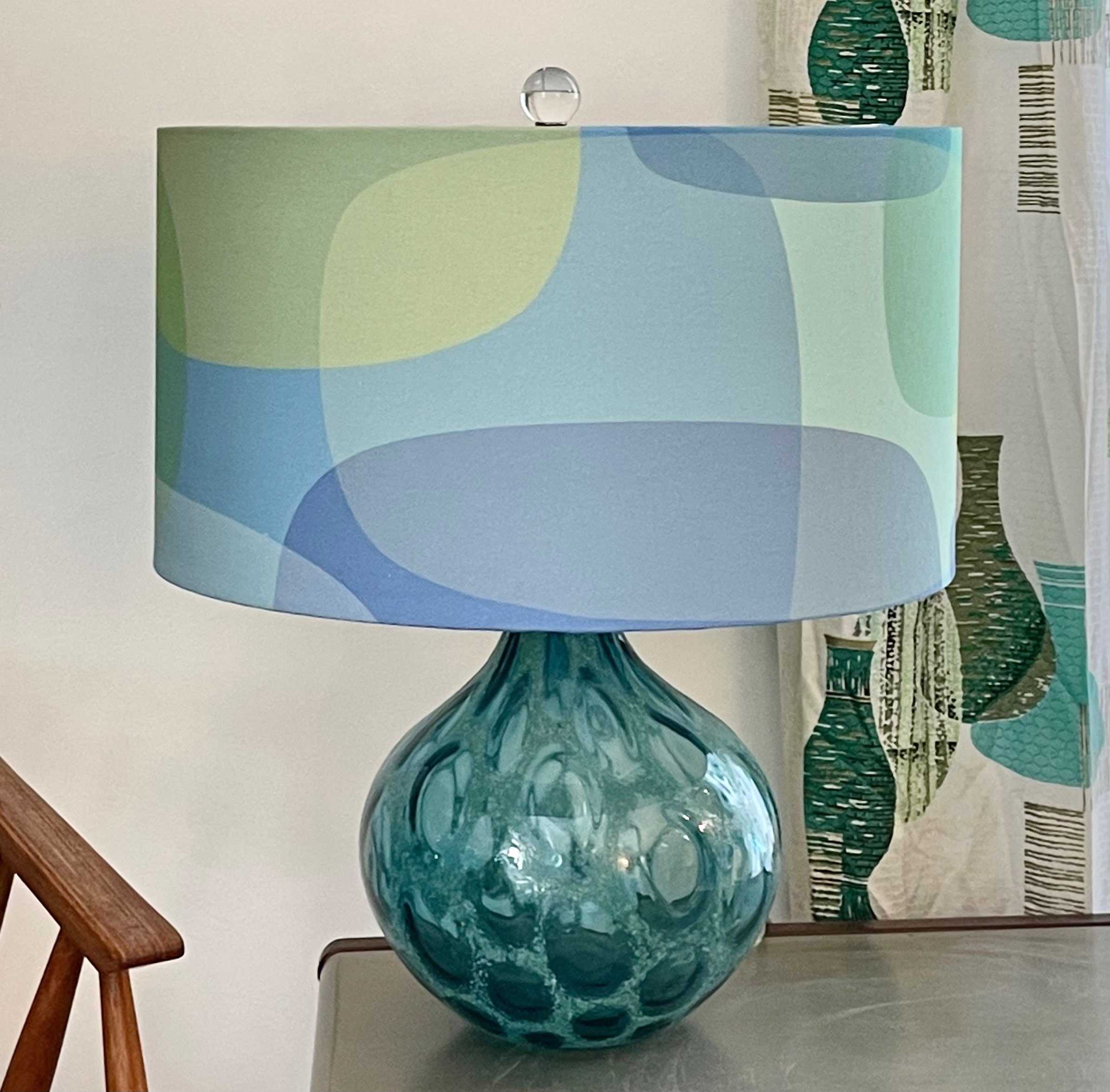
The origin of this design might have already become obvious to you. In developing marketing materials for the first release of Biome, I wanted a mid-century modern vibe, drawn directly from the fluid and superelliptical shapes of the typeface itself. When I focused my attention on repeating patterns, I returned to this idea and borrowed those same shapes, as well as the transparency and overlap effects of the type specimens. Translated to fabric, up to 55 inches wide, I had to consider how the pattern would repeat. My first version maintains one asymmetrical composition the entire width of the fabric, repeated lengthwise every 24". Colorways for this design emphasize qualities of cloudiness, mystery, and dimension. Kept at a large scale, the pattern offers an abundance of futuristic shapes familiar from 20th-century modernism.
Ovoid Bubbles


