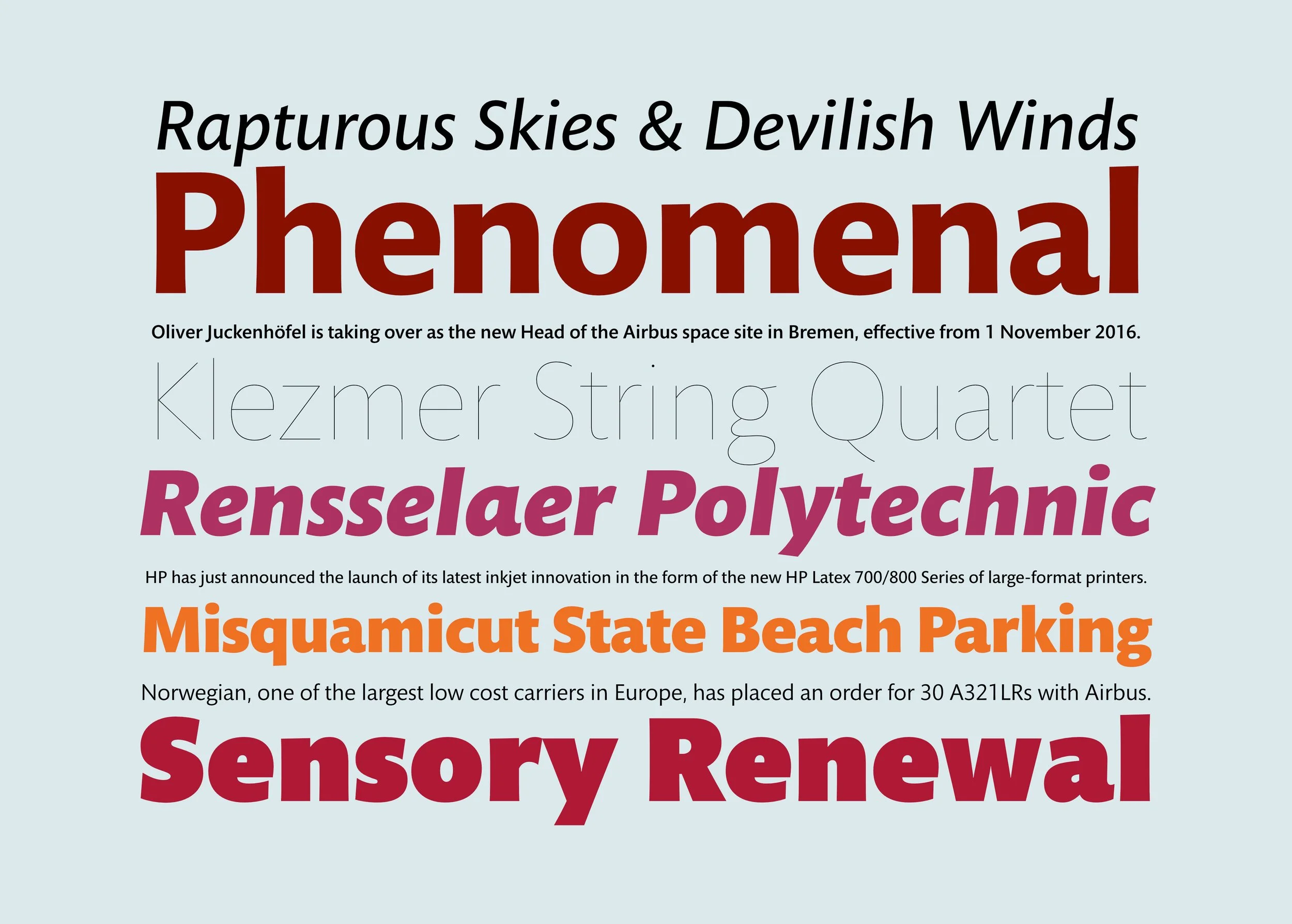
This design goes against the stated purpose of its namesake and partner, Mundo Sans. Why make another serif type when all those excellent renaissance serif faces are available? The answer is time, and technology. In the 21st century, despite all best intentions and wishes, people in developed countries are reading on screen more and more. The screen itself has improved, but the reading environment of screens has its own limitations, however high-resolution. The optial processes of reading on screens is simply not the same as print on paper. In this environment, I noticed that our beloved classics like Bembo and Garamond were losing their strength and vigor, and even their identity, translated (not always well) to the screen. Ink spread and reflected light supported those faces better than cold digital light. Darker, lower-contrast and larger x-height text types tend to stand up to screen reading better. So Mundo Serif is for situations where serif type is needed, and resistance to digital degradation is required. It holds up in modern reading environments. And in matching the original spirit of Mundo Sans, the Serif attempts to purge oddities, snags and drags on readability in favor of ultimate, conventional clarity. And as with the Sans, a large weight range is de rigeur.
Mundo Serif

